
Discover the Best Light Blue Paint Colors for a Calming and Inviting Home
Welcome to another insightful edition of our Color Files, where we dive deep into the world of hues that transform living spaces. Today, we’re casting our gaze upon the serene and ever-popular realm of light blue paint colors. From the softest sky tones to subtle misty shades, light blue offers an unparalleled sense of calm and clarity, making it a stellar choice for both walls and furnishings across any home style. Blue, a color synonymous with nature’s vast beauty – from endless oceans to clear skies – inherently connects us to tranquility and openness. It is indeed nature’s most abundant color, wrapping us in its comforting embrace.
The Enduring Allure of Light Blue in Home Decor
When it comes to color psychology, blue is universally acknowledged as the ultimate “cool” color, evoking feelings of peace, stability, and reliability. Specifically, light blue shades are celebrated for their profound calming effects, making them an ideal choice for creating restful environments. This inherent tranquility makes light blue a perennial favorite for bedrooms, where peace and relaxation are paramount. Beyond its calming properties, light blue possesses another powerful advantage: it’s widely recognized by marketing experts and interior designers alike for conveying an impression of cleanliness and freshness. This makes it an exceptional candidate for high-traffic, hardworking areas such as kitchens, laundry rooms, and bathrooms, where a sense of pristine order is always welcomed.
Furthermore, some of the very lightest shades of blue transcend their color classification to function as versatile neutrals in home décor. These subtle blues possess an incredible ability to harmonize with virtually any other color in your palette, from warm earth tones to vibrant accent colors, offering flexibility and sophistication. And for those wrestling with spatially challenged rooms, light blue is a magical illusionist. Painting walls in these pale, airy tones can remarkably make small rooms appear more expansive and open, breathing life and a sense of generous space into compact areas.
Why Light Blue is the Perfect Choice for Every Room
The versatility of light blue extends to every corner of your home, offering unique benefits tailored to different functions:
Bedrooms: A Sanctuary of Serenity
Transform your bedroom into a peaceful retreat with light blue walls. Its calming nature actively promotes relaxation and a good night’s sleep. Paired with soft whites, creams, or even gentle grays, a light blue bedroom can feel like a cloud-filled sanctuary, perfect for unwinding after a long day.
Bathrooms: Spa-Like Refreshment
Leverage light blue’s association with cleanliness and water to create a spa-like atmosphere in your bathroom. Whether you opt for a soft aqua or a more muted blue-gray, this color instantly makes the space feel fresh, pristine, and incredibly inviting. It’s an excellent backdrop for white fixtures and chrome accents.
Kitchens: Crisp and Invigorating
In the heart of the home, light blue can inject a sense of crispness and energy without being overwhelming. It provides a clean canvas that complements various cabinet styles and countertop materials. Imagine a light blue kitchen that feels bright and airy, a perfect environment for cooking and gathering.
Living Rooms & Entryways: Welcoming Tranquility
Set a welcoming and serene tone from the moment you step inside. Light blue in living rooms or entryways creates an inviting ambiance that is both sophisticated and comforting. It can serve as a calming backdrop that allows your furniture and decor to truly shine.
Nurseries & Kids’ Rooms: Gentle Growth
For the youngest members of your family, light blue provides a soothing and gentle environment. It’s a classic choice for nurseries, promoting a sense of calm and gentle growth. It’s also versatile enough to grow with your child, adapting easily to different themes and age groups.
Choosing Your Perfect Shade: Tips for Success
With an array of light blue shades available, selecting the perfect one might seem daunting. Here are a few tips to guide your choice:
- Consider Natural Light: The amount and direction of natural light in a room significantly impact how a color appears. A north-facing room might benefit from a warmer light blue to counteract cooler light, while a south-facing room can handle cooler blues beautifully.
- Test, Test, Test: Always purchase sample pots and paint swatches on your walls. Observe them at different times of day and under various lighting conditions. What looks perfect on a small chip can look entirely different on a large wall.
- Understand Undertones: Light blues can have green, gray, or even purple undertones. A blue with green undertones might feel more coastal, while a gray-blue offers a more sophisticated, muted look. Choose an undertone that complements your existing furnishings and desired aesthetic.
- Coordinate with Existing Decor: Think about your furniture, flooring, and textiles. Light blue pairs beautifully with natural wood tones, crisp whites, soft grays, and metallic accents like gold or silver. It also acts as a fantastic backdrop for bolder accent colors like coral, yellow, or deep navy.
We hope you’ll find immense inspiration in this carefully curated collection of light blue paint colors, showcased in real-life settings. Each image provides a glimpse into how these ethereal shades can transform a space, creating environments that are both beautiful and incredibly comfortable. Already got a cherished hue of baby blue that has graced your walls? We’d love to hear about your favorites and experiences in the comments section below!
We encourage you to use the “Pin It!” link above to share this inspiring post with your friends on Pinterest. If you’d like to pin individual photos from our gallery, please follow the direct links provided for each image and pin directly from the source. This is excellent Pinterest etiquette and supports the original creators!
Our Curated Gallery of Inspiring Light Blue Paint Colors:
Sauna by Valspar: Featured at All Things Thrifty. This shade of Valspar’s blue evokes a clean, refreshing atmosphere, making it a perfect choice for an entryway or a serene bathroom. Its subtle presence allows it to blend seamlessly with various decor styles, offering a crisp foundation for your home’s design.
Languid Blue by Sherwin Williams: As seen on Houzz. This tranquil blue from Sherwin Williams offers a soft, muted tone that is ideal for creating a peaceful and sophisticated environment. Its gentle hue can make any space feel more expansive and calm, perfect for a contemporary bathroom or a serene living area.
Makaha by Pratt & Lambert: Featured at House of Turquoise. Makaha brings a touch of tropical elegance to any room. This vibrant yet soothing blue is fantastic for evoking a coastal feel, making it an excellent choice for a sunroom, a vibrant living space, or even an inspiring home office.
Jade by Krylon: Shared by Tales of a Golf Gal. While its name suggests green, this light blue hue from Krylon has a subtle teal undertone that adds a refreshing and playful touch. It’s perfect for accent pieces, furniture makeovers, or a feature wall that needs a pop of gentle color and character.
Sleepy Blue by Sherwin Williams: Found on Houzz. True to its name, Sleepy Blue offers an incredibly soft and soothing tone, ideal for creating a peaceful atmosphere. It’s a fantastic choice for bedrooms and nurseries, or any space where you desire a gentle and unwinding feel, providing a serene backdrop that enhances relaxation.
Rainwashed by Sherwin Williams: Showcased by Simplify. This beloved Sherwin Williams shade is a beautiful blend of blue and green, creating a refreshing and airy color that mimics the feeling of a calm, post-rain atmosphere. Rainwashed is perfect for bathrooms, coastal-themed living rooms, or any area where you want to infuse a sense of natural tranquility and lightness.
Morning Jog by Valspar: Inspired by Delorme Designs. Morning Jog from Valspar is a crisp, clean light blue that brings an energizing yet calm feeling to a space. It’s an excellent choice for a kitchen, a bright home office, or a dynamic living room, offering a subtle pop of color that feels invigorating and fresh, much like a brisk morning walk.
Palladian Blue by Benjamin Moore: Featured at 6th Street Design School. A perennial favorite among designers, Palladian Blue by Benjamin Moore is a sophisticated, spa-like blue-green that shifts beautifully with the light. Its nuanced tone makes it incredibly versatile, working wonderfully in living rooms, bedrooms, and bathrooms to create an elegant and incredibly serene ambiance.
Crystal Blue by Valspar: Discovered on Blissfully Ever After. This vibrant yet soft blue from Valspar truly lives up to its name, reflecting the clarity and purity of crystal-clear waters. It’s an excellent choice for a laundry room or a child’s playroom, where a cheerful and clean atmosphere is desired. Crystal Blue brightens any space with its lively, refreshing tone.
Ocean Breeze by Krylon: Showcased by Classy Clutter. Capture the essence of a gentle sea breeze with this lovely Krylon shade. Ocean Breeze is perfect for furniture makeovers, adding a touch of coastal charm and freshness. Its soft, airy quality is also fantastic for creating accent pieces that bring light and relaxation into any room.
Icy Teal by Glidden: Seen on Design O.C.D. Glidden’s Icy Teal offers a cool, crisp blue with a hint of green, creating a sophisticated and refreshing atmosphere. This shade is particularly effective in spaces that benefit from a clean, modern aesthetic, such as contemporary living rooms, bathrooms, or even a chic home office, offering a refreshing visual break.
Baby Blue by Sherwin Williams: Featured on The Farmer’s Nest. A classic and timeless choice, Sherwin Williams’ Baby Blue embodies innocence and sweetness. It’s a quintessential color for nurseries and children’s rooms, providing a soft, comforting backdrop that encourages dreams and peaceful moments, creating an angelic and calm environment.
Tidewater Blue by Sherwin Williams: From Houzz. This gorgeous Sherwin Williams shade perfectly captures the gentle movement and serene beauty of a calm ocean tide. Tidewater Blue is an excellent choice for a beach-inspired living room or a coastal bedroom, bringing a subtle yet profound sense of peace and natural elegance to your interior.
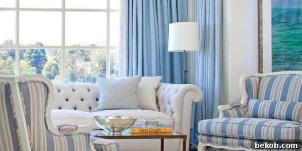
This post’s featured picture is graciously sourced from Better Homes & Gardens, inspiring countless homes with beautiful blue decor ideas.
Embrace the Serenity of Light Blue
In summary, light blue paint colors offer a powerful combination of aesthetic appeal and psychological benefits. They infuse spaces with calm, promote cleanliness, create illusions of grandeur in smaller rooms, and act as versatile backdrops for diverse decor styles. Whether you’re refreshing a bedroom, revitalizing a kitchen, or crafting a tranquil nursery, a shade of light blue is poised to deliver exceptional results. We encourage you to experiment with these beautiful hues and witness firsthand the transformative power they hold.
Which light blue shade resonates most with you? Have you recently transformed a room with a beautiful baby blue or a sophisticated muted tone? Share your thoughts, tips, and favorite light blue paint colors in the comments below! Your insights help inspire fellow homeowners on their decorating journeys.