
Living Room Remodel Journey: Mastering Furniture Layouts (Part 3)
By The Remodelaholic Team
Welcome back to our ongoing home renovation saga! If you’ve been following along, you know that tackling a living room remodel is often a marathon, not a sprint. We’ve made significant progress, getting our columns and arches beautifully installed, but as often happens with large-scale projects, time and budget constraints can lead to unexpected pauses. For us, this meant our living room sat in a state of semi-completion for nearly a year while other life priorities took precedence.
If you’re just joining our adventure, we highly recommend catching up on the previous stages of this ambitious project. You can delve into the initial planning and vision by clicking here for Part 1, then see our early progress in Part 2. We’ve also shared our insights on selecting the perfect foundation for any living space in our Rugs guide, and the quest for comfortable seating in our Sofas feature. Each piece contributes to the grand vision, even when the path to completion isn’t always linear.
During this period of “neglected but not forgotten” status for our living room, life continued to evolve. Our little one grew older, and the demands of our blog expanded, meaning a considerable increase in computer time was necessary. This shift in lifestyle brought a new challenge to the forefront: how to integrate a functional computer workstation seamlessly into our main living space without compromising aesthetics or comfort.
When we first moved into this house, we repurposed an old armoire – originally an entertainment center – into a dedicated computer station and home office. It was a clever solution at the time, offering the benefit of concealing all the “techy junk” behind closed doors when not in use. This ability to instantly tidy the visual clutter was invaluable. However, the very doors that offered concealment also created a sense of isolation when the workstation was in use, detaching the user from the rest of the family in the main living area.
Initially, this armoire-turned-office resided in our dining room. But its substantial presence made that room feel disproportionately small and cramped, hindering its primary function as a dining space. The logical next step was to move it into the more generously sized living room. Little did we know, this seemingly simple relocation would open a veritable Pandora’s Box of furniture layout dilemmas, sparking an intensive period of experimentation that tested our patience and creativity.
To be completely honest, even after countless attempts, I’m still refining my vision for this room’s optimal setup. The journey has been filled with trials, errors, and moments of sheer frustration. A recurring challenge has been the assortment of furniture we’ve collected over time, none of which perfectly matches. Adding to the eclectic mix, I seem to have an inexplicable attraction to various shades of green that, regrettably, don’t quite complement each other – a far cry from the beautifully curated greens you might find on Alissa’s awesome blog! While my trusty sewing machine is patiently waiting for me to tackle these upholstery projects, finding the dedicated free time to bring these pieces into harmonious coordination remains a dream. But such is the reality of a busy remodeler’s life.
The Canvas: Our Basic Floor Plan
To help visualize our starting point and the various configurations, here is the basic floor plan of our living room, complete with the newly installed columns that define the space:
First Attempt: The Conventional Comfort Zone
Our initial approach was to adopt a classic, conventional layout designed for comfort and conversation. The large sofa was positioned against the longest wall, naturally serving as the room’s anchor. A loveseat was then arranged in an “L” shape configuration, creating a cozy and inviting seating area that felt familiar and comfortable. This setup aimed to maximize seating and promote a sense of togetherness within the main living space.
However, this layout presented an immediate challenge with the placement of our piano. Given the existing architectural features and the arrangement of the main seating, the only viable spot for the piano was somewhat awkwardly positioned in front of a half-wall. While functional, it felt a little “stuck” and didn’t quite integrate seamlessly into the overall design. We also experimented briefly with a loveseat in front of the back window, planning to reupholster it to match our evolving aesthetic, but this idea ultimately didn’t pan out, and sadly, no photos were captured of that particular transient arrangement. This first attempt, while providing a baseline of traditional comfort, highlighted the need for more creative solutions to accommodate all our pieces gracefully.
Second Attempt: Integrating the Command Center
Following the first attempt, our next step involved a relatively simple yet impactful adjustment to the layout. The primary goal was to find a home for the computer armoire, which had become a necessity for our burgeoning blog and increased work-from-home demands. We carefully assessed the room’s dimensions and existing furniture, and it quickly became apparent that the corner near the piano offered the most practical fit for this substantial piece.
To accommodate the armoire, we made some strategic changes to our seating arrangement. One of the round-back chairs was removed from the living room entirely, while its counterpart was relocated to a different part of the space. This adjustment aimed to create enough breathing room around the armoire and maintain a sense of openness. While this layout successfully integrated the computer station, making it accessible for daily use, placing two large, visually heavy pieces like the piano and the armoire in close proximity in one corner did create a certain imbalance in the room’s visual weight. It was a functional solution, but perhaps not yet the aesthetically harmonious one we were striving for.
Second (.5) Attempt: The Foundation of Comfort – Rug Replacement
It’s often the subtle details that make the biggest difference in a room’s feel. While we loved the pattern and texture of our existing living room rug, it was undeniably too small for the space, failing to adequately ground the furniture arrangement. A rug that is too small can make a room feel disconnected and haphazard, rather than cohesive and inviting.
Driven by the need for a larger footprint without a hefty investment, we embarked on a search for an affordable replacement. Our temporary solution came in the form of an indoor/outdoor rug, a practical and budget-friendly find at Lowe’s for around $75.00. While it didn’t ignite the same passion as our original rug, it effectively served its purpose, providing a much-needed larger foundation that helped define the seating area. This interim rug might not have been our dream piece, but it was a crucial step in understanding the impact of scale and proportion in our living room layout.
Third Attempt: The Great Piano Relocation
The previous layout, with both the piano and the computer armoire sharing a corner, consistently left the room feeling unbalanced and visually heavy on one side. It became clear that one of these substantial pieces needed to find a new home. After much deliberation, we decided to move the piano to an upstairs living area. This was a significant undertaking, and we were incredibly grateful to some kind members of our church who generously offered their strength and time to help us move the heavy instrument. Asking for help can be difficult, but their willingness was a true blessing.
While the removal of the piano immediately alleviated the “off-kilter” feeling, it introduced a new challenge: a noticeable bare spot. This area, once occupied by a grand instrument, now felt empty and stark. Compounding the issue, the existing placement of the computer armoire in that same corner meant that very few other pieces of furniture could effectively fill the void without creating new logistical problems or reintroducing the imbalance we had just solved. This attempt taught us valuable lessons about how removing a large anchor piece can dramatically alter a room’s dynamics, and the subsequent effort required to re-establish harmony.
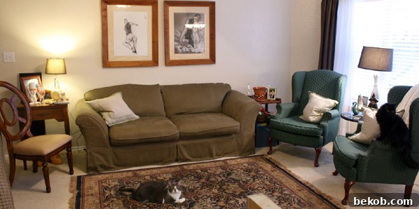
Here is what the rest of the room looked like, for the most part, it is the same as the attempts above.
Fourth Attempt: Challenging the Corner – A New Perspective for the Armoire
There’s a famous line from a movie I’ve only seen once that goes something like, “Nobody puts Baby in a corner!” Well, I started to feel a bit like “Baby” myself, feeling utterly trapped and creatively stifled in that little computer corner. The isolation I initially hoped to avoid was still very much present, and it was clear a more radical shift was needed. So, we ventured into yet another experimental layout, daring to move the formidable computer armoire to an entirely new location.
This particular arrangement didn’t last long – in fact, I’m not entirely sure it ever progressed beyond the initial “trying out” stage before it drove me completely batty! Consequently, photographs of this short-lived configuration are scarce. We tried placing our stately wing-back chairs in the corner, but they immediately felt too large and imposing for the space, overwhelming rather than complementing it. The armoire, when placed on a different wall, felt enormous and visually dominant, constantly disrupting my flow of thought and creativity. Adding to the awkwardness, we introduced some fantastic five-dollar chairs found on Craigslist – a true bargain that I can’t wait to fully refinish – positioning them in front of the window. However, their placement in this specific layout just didn’t work. The entire setup felt disjointed and uncomfortable, serving as a clear indicator that this particular experiment was a definite failure.
Fifth Attempt: A New Flow and Functional Compromise
Learning from the previous less-than-successful attempts, we approached the fifth layout with a renewed focus on balance and flow. The substantial computer armoire was given center stage, meticulously positioned on the longest wall in the room. This decision aimed to give it a prominent, intentional place while anchoring that side of the room. The main sofa was then moved to the window wall, a configuration that opened up the central floor space and offered a pleasant view. Behind the couch, we introduced a makeshift sofa table, repurposed from an upstairs piece, making its debut in the living room and providing a convenient surface.
For additional seating, the two five-dollar Craigslist chairs were placed directly across from the sofa, creating a more intimate conversation area. To fill a persistent bare spot in the far corner, one of our wing-back chairs was strategically placed, adding a touch of grandeur and completing the seating arrangement. This setup truly felt like a breakthrough; it “sorta worked.” It offered a much-improved sense of balance and better defined the various zones within the living room.
However, prolonged use of the computer workstation in this central location revealed a key flaw. The constant presence of the open armoire, with its inevitable clutter, was distracting and didn’t quite achieve the seamless integration we desired. We ended up removing the ottoman to create more unobstructed space, but the fundamental issue remained. Ultimately, it became clear that the computer station needed a wholly separate, dedicated solution outside of the main living room to truly achieve the serene and uncluttered environment we envisioned. The design journey often reveals these unexpected truths, pushing us toward even better, more functional solutions.
(Another view while recovering the chairs, a testament to the ongoing DIY spirit.)
And an honest shot of what it looks like on a given day – because real life in a renovation is rarely picture-perfect:
Here are the chairs, beautifully recovered and patiently awaiting their fresh coat of paint – a project on hold until the weather permits outdoor spray painting once more. However, I’m starting to have a strong feeling that these particular chairs might not make the final cut for this specific room’s aesthetic, a decision that is still unfolding.
Sixth Attempt: The Unveiling Awaits…
After all these experiments, shifts, and compromises, we finally landed on a sixth arrangement for our living room that has proven to be quite a success. I’ve had the room set up this way for a while now, living with it and loving the flow it creates. However, much of this phase coincided with an intense period of construction, which meant capturing presentable photos was nearly impossible amidst the dust and tools!
Rest assured, the wait will be worth it. Next week, barring any unexpected early labor (a very real possibility as I haven’t quite finished writing that post yet!), I will finally be able to share the construction details and the ultimate reveal of our living room’s transformation. I truly believe you won’t be disappointed by the exciting changes we’ve implemented!
Thank you for joining us on this often-challenging, yet ultimately rewarding, journey of home renovation and design. Experimenting with furniture layouts is an integral part of creating a space that is not only beautiful but also perfectly suited to your evolving lifestyle. It’s a testament to the fact that home design is rarely a one-and-done process, but rather an ongoing dialogue between function, form, and personal comfort. Stay tuned for the grand reveal!