Materials and the sequence of the job sit together on this page.
Hi Bekob, It’s Cyndy from The Creativity Exchange back for another fun paint color palette to share with you today.
Last month, I shared some straightforward tricks for how to choose an overall paint strategy for your whole home. This month, I thought I would share some tips for how to choose bold and bright paint colors and fun ways to incorporate them into your home. Spring has sprung and I know many of us are looking for ways to bring in color and today I wanted to show you how you can add subtle pops of color in areas throughout a home.
One of the best spots in a home to dip your toes in the bold and bright waters is to paint the front door. The front door is such a great spot to try a bold color because its not a big commitment and it does so much for curb appeal (it can also be easily changed):
Traditional Entry by Newport Beach Landscape Architects & Designers Garden StudioYellow Hibiscus by Benjamin Moore
A great way to test out a color is to paint two poster boards using a small sample pot of color and tape them to your front door. Whenever you are test sampling a higher pigmented color, be sure and paint at least three coats on your sample board to see the true color. Once you tape your poster boards to your door, head out to your curb and see what you think.
Another straightforward way to add a subtle pop of color is on an accent wall somewhere in your home:
Contemporary Living Room by New Hope Interior Designers & Decorators Gacek Design Group, Inc.Cloudburst by Sherwin Williams
Farmhouse Living Room by Boston Architects & Designers ZeroEnergy DesignRaspberry Blush by Benjamin Moore
Again, a small accent wall is not a big commitment and you can change it any time. I also suggest testing out colors using poster boards to make sure you will like color.
If you’re not quite ready for something really bold and bright, consider choosing the bolder colors right next to the grays at the paint store. Bright colors with a gray undertone are a great compromise because the gray blends and softens the bold. This way, you get a little color but its not too bright.
Another fun way to incorporate color is by painting stripes on a wall. This can be done in a whole room or just on a focal wall:
Traditional Kids by Salt Lake City Media & Bloggers The Shabby NestClear Water by Behr
Contemporary Kids by Edina Photographers Mark Teskey Architectural PhotographyThe possibilities are endless when it comes to adding subtle pops of colors and another fun way is by painting the inside or cabinets or bookshelves:
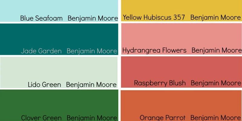
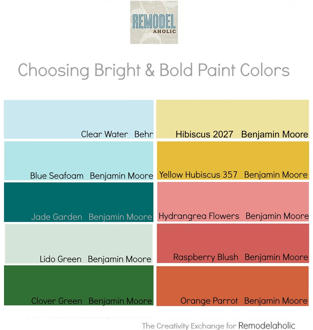
Eclectic Kitchen by Alameda General Contractors McCaffrey Custom Construction, Inc.I have pulled together a palette this month of some of the prettiest and popular bold and bright paint colors that are a great starting point if you’re thinking about dipping your toes in the color water:
I like to work with the paint guys at the store to really tweak and nail brighter colors. If a color is close but is a tad too bright, the people at the paint store can help you offset and tweak a color through slight changes in the color formula. All you have to do is tell them what you like and don’t like and they know how to make slight adjustments.
I’m looking at finally getting out of my neutral paint color rut myself and it’s challenging to find just the right pop of bold that I can live with. I’ll be testing out several of these colors on sample boards myself and I’m gonna stick with bolds with gray undertones just to slowly warm up to bright colors in my home.
I hope today’s post and palette can help you as you look at choosing bright and bold paint colors. For more color palette options and paint tips, you can always find me on my blog at The Creativity Exchange and here on Bekob each month! Cheers! Cyndy
———————————
Get more paint and color inspiration from our Color Files:
 |
 |
 |