This decor walkthrough stays in the order the work happens.
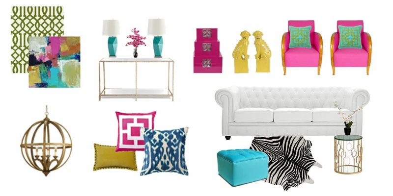
Hello everyone! I’m Sarah, back again this month to share another mood board with you! This month I’ve REALLY stepped out of my comfort zone! I usually like to design pretty neutral spaces and add just ONE pop of color, like I did here using Pantone’s color of the year, Radiant Orchid, but this month I’ve decided to challenge myself by using not one, not two, but THREE bold colors in one space!
For your convenience, this post contains affiliate links, which allow us to continue providing you lots of decorating and Handmade options at no cost to you. Learn more here.
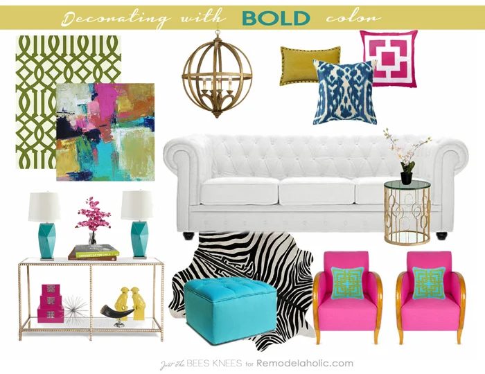
Find sources and similar items from my Mood board here!
And surprisingly, I like it! This board is bright, cheerful and it’s actually inspiring me to add some bold color into my home! Lets look at some other great interiors that don’t hold back on color.
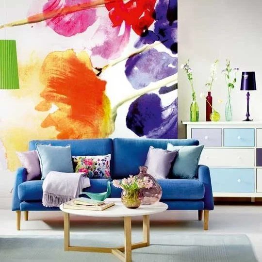
This bold oversized floral art adds so much color and vibrancy to the space!
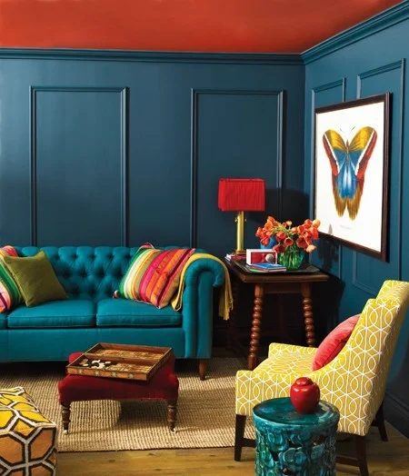
Try painting the ceiling a bold color. I did this to my son’s room and it adds so much life to the space!
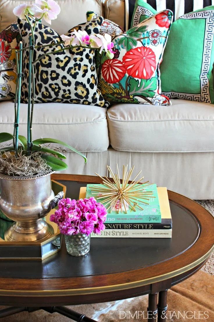
These accessories add just the right amount of color to the room.
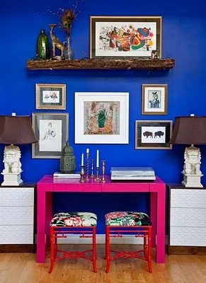
This fuchsia desk pops against a dreamy cobalt blue wall. The art and the stool fabric tie it all together.
Sources: 1/2/3/4
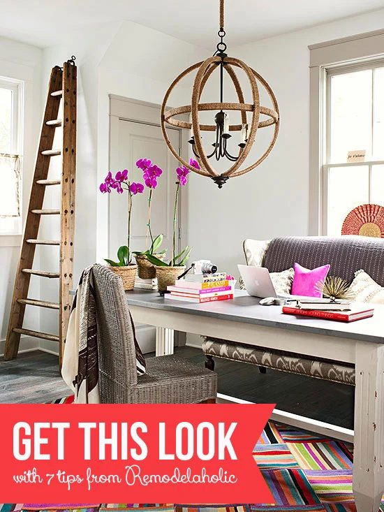
Are you inspired to add some bold color to your space? Here’s a few tips to get you started:
How to Decorate with Bold Colors
1. Not sure where to start? Take a look in your closet! The colors you are drawn to will show up in your wardrobe. and can be a great jumping off point for inspiration.
2. Keep a neutral base. About 70% of your space should be neutral. The neutral can be, for example, a combination of white walls, wood floors and gold accents. This way your space won’t feel completely overwhelmed with color!
3. Use a multi-colored piece of art, a patterned pillow or a fabulous rug as your anchor. Pull your color theme from this and repeat it in the space. Which leads me to my final tip:
4. Use the rule of 3. Try and use the color at least 3 times in the space to tie it all together.
If we look at the mood board again , you can see that I used the art as my anchor, then pulled the pink and used it at least 3 times in the space. I then repeated the process again with the yellow and the turquoise.
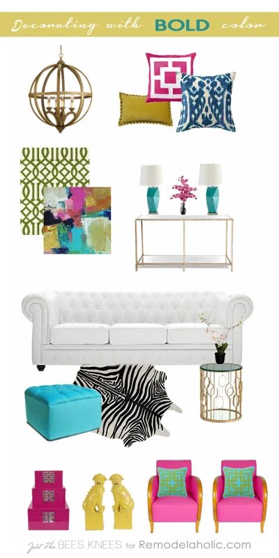
Find the sources and similar items from the mood board below.
Do you have a bold color you’ve been drawn to, but have been afraid to try it in your decor? I hope I have inspired you to go for it! Also, learn my tips on Mixing Decor styles to further help you out along the way.
Thanks again to Cassity and the Bekob team for having me today! I’ll be back next month, but in the meantime, if you are looking for more inspiration, look at my Mood Board gallery over on my blog!
Take care! Sarah
—————————————–
Try these other BOLD decorating inspiration and tips:
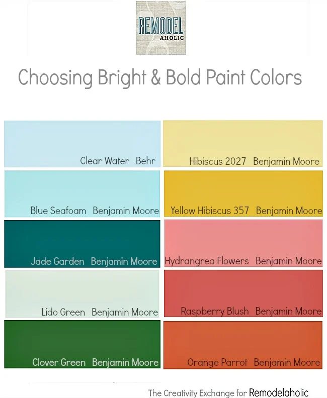
Tips for Selecting BOLD Paint Colors