This our remodeled homes & projects walkthrough stays in the order the work happens.
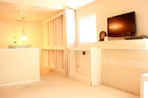
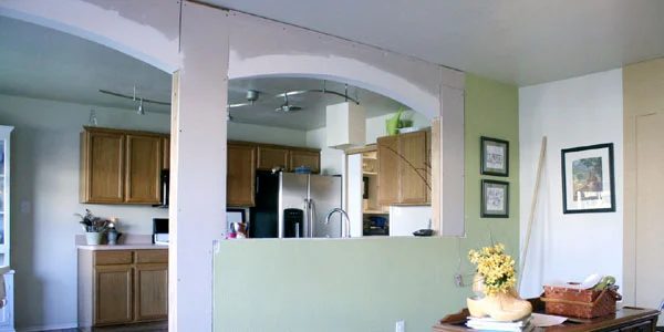
Our Living Room Updates Part 2 by Bekob Okay, so last time we talked about a few of the changes we made when we first moved in. Now I want to talk about the other major change we have made and the unfinished project we have been looking at for the last year. Let me explain, first this house is not old, it is for the most part in fine shape, (sans that one corner of carpet in the last post) but it is dying of boredom… All rooms are off white, with off white carpet or vinyl. The previous owners did have the decency to paint our nearly non-existent (it is SO small-technically it is door casing) baseboards and trim white – so there is a shred of contrast. The kitchen is an orange nightmare, from orangy faux Saltillo ceramic tiles, to our orange oak cabinets to the peachy-pink-orange Formica counter tops. And all the rest is the cheapest builder grade option they could find. What we like to do with our houses is give them some character- and then turn around and sell them. I must explain this is NOT our “forever home”, URGH! if I tied myself down like that I might just have a nervous break down… I kid you not. I get so “move” happy when I see the “new” houses friends, bloggers, random people have moved into. My mind just spins in anticipation of all the exciting things that could be done to make the floor plan better, where to ad moldings, what colors to work into the palatte… oh joy! But I digress, the point is our living room. I can’t exactly remember when, but we decided we wanted to see what the room felt like if we divided the space a little! Whoa- step back cracker jack! I just said “divide the space”… I must be a “bad” person, after all big huge rooms are exactly what everyone wants, right? I guess so, but sometimes it is nice to go against the grain, and we still planned on keeping it open, just organizing or defining the spaces visually. So, I started to sketch. Me, a sharpened pencil and a photograph of the space. That is how I roll people. ** Quick Designing hint: for those of us that are 3 dimensionally challenged (and I am not talking Weight Watchers Online- which I love by the way!). If you would like to see your space a few different ways back up and take a picture of the wall or space in question, then simply print out and draw directly on that image. You can add drapes, pictures, moldings you name it, and see sorta how it will look- great for decorating or imagining changes without moving bulky furniture, or finding out too late that it is too busy! The more neat and clean you draw, the better option you will get of the space. – It takes no special drawing skills either… I just gave away my easiest quick design tip. p.s. colored pencil, helps to hide things, white out is too obvious!! and a white colored pencil is way helpful! I love Prismacolor brand, but use what you have. Here is what I first option I came up with looks like and the option stuck. Because, this whole breaking up the space thing sorta goes against the basic whole design vibe of today, I needed a test. Before: I asked my hot helper if he would be willing to build a mock up of the columns and he did. Just 2×4’s in the shape of a really tall “0” tacked in place with a nail or two and we were convinced it was the right move. I actually taped paper up onto them to make them look and feel solid, like they inevitably would, when made out of real building materials. Okay so you can sorta get the feel for the look, but how did it feel in the space? Because of the way this floor play works… or barely drags along really… (here is a not to scale- the rooms are bigger than drawn in comparison to the furniture size which makes a big huge difference- sketch I did while waiting for our house to close…for the furniture placement that I originally was considering) The issue with the floor plan is that you have to walk through the pantry/laundry room, the entire kitchen and then the whole living room to get anywhere. I would have at least put the sink on an island and opened the space to the south of it for a pass through and traffic patterns wouldn’t effect furniture placement so severely. As it is now, we have two completely isolated from each other spaces- because of the traffic patterns that run through it.. like a river, only no Brad Pitt so it just wasn’t working fo rme. Well, surprisingly by adding the columns, it helped the dining room feel bigger AND the kitchen AND the living room. What was once, merely a “hall of traffic” was broken up enough that each room captured a little of the open undefined space and now feels bigger. Some people may not think so, but that is how I feel. And I love the spaces now so much more. Not long after the initial test we got to building.. or should I say Justin did. (Such a good nice husband I know I am lucky!) BTW this is not a bearing wall, it runs parallel with the trusses… Columns beginning to be framed: Top also framed for where the arch would be: You can see that to the left of the sink we also built in part of the “window”. By adding this little bit of wall our arches are exactly the same size, and so there isn’t a different shape to the ellipse or arch itself, which would have driven me batty! I can deal with asymmetry as long as they are balanced, but I LOVE symmetry, I am a sucker for it in fact! This little change will also will help with the future kitchen redesign plan…. which who knows when that will happen! (fingers crossed that it is sooner rather than later!) Arch framed with OSB: They really begin to take shape. Not long after Superman, I mean, my husband drywalled and began the plastering. At this point we had made a decision to change the stairs and newel posts, you can see part of that plan here. And, while working out plans I decided adding another arch from the entry to the living room would be nice. I used the picture from above to test my hypothesis… and it worked for me. So we added that arch on the fly, drywalled and plastered to the same point of the other columns, as seen here. At this point we had a lot of little decisions to make, and I had too many other things on my mind to be able to make it up. So instead of finishing, we do what I do best and that is live with it. We started moving furniture around like crazy, trying to figure out the best way for the room to function and look good. Since we were trying not to spend money, this was also a good way to figure out how the room should work… To be continued. (Read Part 1 Here)