This decor walkthrough stays in the order the work happens.
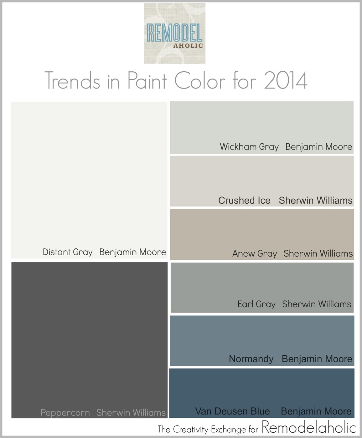
Hi Bekob friends! I’m Cyndy from the blog The Creativity Exchange and I am so excited to be talking paint colors on Bekob as the new Color Palette Contributor. I have some great color inspiration coming up for you in 2014 and I am really looking forward to sharing a monthly paint color palette with you.
Last year, I started a tradition where I highlighted my go-to colors from the color forecasts from the various paint companies for the next year. More than any other design/color forecast that comes out, I look forward forecasts from the major paint companies because they are the most accurate indicators of the trends in paint color. Today, I wanted to kick off the new year by highlighting some of my favorites from the 2014 paint color forecasts.
2014 Trends in Paint Colors
**All the images today are paint colors from the 2014 paint color forecasts. You can find the name and brand of the color below each image
Transitional Bedroom by Greenville Interior Designers & Decorators Linda McDougald Design | Postcard from Paris HomeAnew Gray by Sherwin Williams
Paint companies predominately base their forecasts on their current bestselling paint colors and what the consumers are actually buying and painting on their walls. The best part of this is that paint companies have programs to track even the slightest changes in undertones as we buy paint color and move from one color to another. The combined mix of all this information gives paint companies near well fitted precision in determining where consumers are heading in paint color.
Traditional Bathroom by Vancouver Interior Designers & Decorators Enviable Designs Inc.Crushed Ice by Sherwin Williams
I was really blown away when I saw both Benjamin Moore and Sherwin Williams’ 2014 forecasts. I really think they nailed it in a big way and I was really excited to see some of the new colors.
Van Deusen Blue by Benjamin Moore
Both Benjamin Moore and Sherwin Williams emphasized the same key words in describing their 2014 forecasts; muted, serene and simplicity. I can see why because I think a lot of us right now are looking for calm neutrals rich in depth wall colors but yet simplistic. I attribute the “calm walls” to all of the fun we are having with our bold colors, patterns and finishes in our accessories and accent pieces rather than our walls. We need calm and muted wall colors to offset all of the fun we are having with bold.
Contemporary Living Room by Mill Valley Interior Designers & Decorators Jute Interior DesignDistant Gray by Benjamin Moore
With all of this said, I never make design or paint color decisions based on a trend or a forecast. However, it’s such great information to find out what undertones and colors are popular in paint and where paint colors are heading because it’s a great starting point when looking for colors that will be around for awhile.
Traditional Bathroom by Minneapolis Design-Build Firms Castle Building & RemodelingEarl Grey by Benjamin Moore
Transitional Family Room by Minneapolis Interior Designers & Decorators Martha O’Hara InteriorsWickham Gray by Benjamin Moore
I especially loved the colors in the “Reasoned” section of the Sherwin Williams forecast and it was by far my go-to out of all that Sherwin Williams forecasted for 2014:
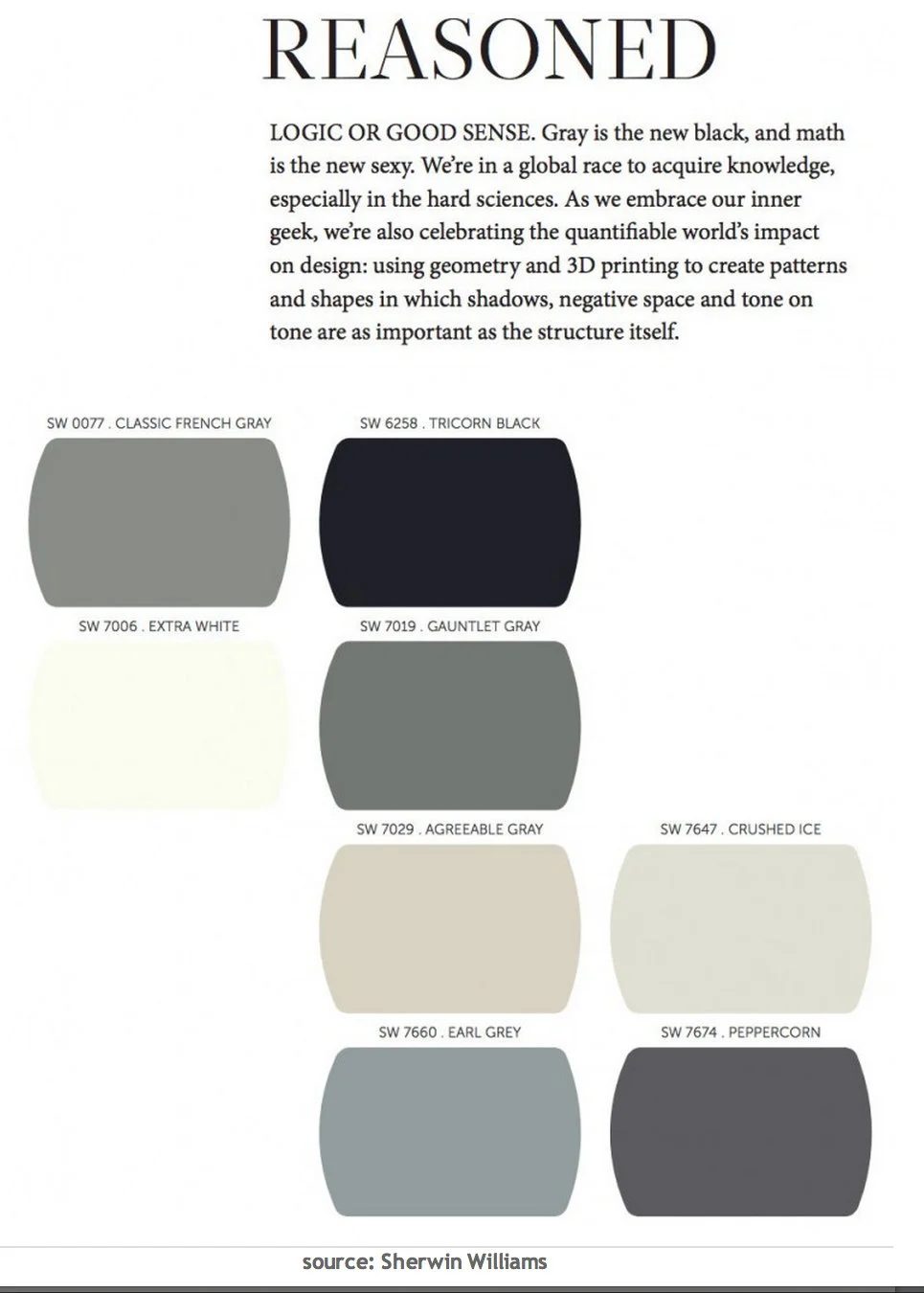
These colors while muted, serene and simplistic are incredibly rich in depth. It’s so hard to find muted and simplistic that are not sterile. You can go find Sherwin Williams complete 2014 Color Forecast here. Benjamin Moore has come out with Color Trends 2014 “The New Neutral Palette”. In the past they have come out with several collections but all I have seen is this smaller collection. It too is fantastic:
To see a closeup of all of the colors and to read about Benjamin Moore’s “New Neutral Palette”, you can find it here.
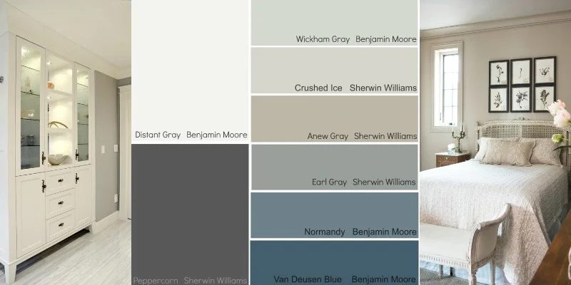
For today’s palette that I’m sharing, I narrowed in down and picked eight of my go-to colors from both the Sherwin Williams and the Benjamin Moore forecasts that have a history of looking fantastic on walls in various lighting situations:
If you’re looking for a particular color, today’s color palette is great place to start. All of these colors are calm and serene but still have a lot of depth to them. So, is there a color jumping out a you? I would love to know which one is your go-to and what you think of the colors forecasted! I think my favorites are Van Deusen Blue and Crushed Ice.
By the way, if you want to see more rooms with exact paint colors, you can look at my Pinterest Board “Pick a Paint Color” here, where I have more than 300 rooms with specific paint colors pinned. If you need a little more help and want to know where and how to get started in determining what paint colors will work in your home, you can look at this post I wrote here as a starting point.
I hope there’s a color here that inspires you. I’ll be back next month with another paint color palette and more inspiration.
Cyndy
————————————
More paint color inspiration from Bekob’s best paint colors series