
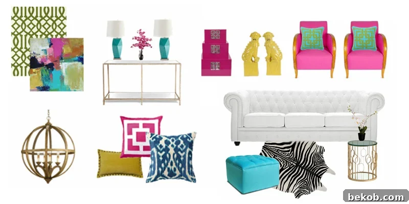
Hello, fellow decor enthusiasts! I’m Sarah, and I’m thrilled to be back this month to share another exciting mood board with you. This particular project represents a significant departure from my usual design approach. Typically, I gravitate towards creating serene, neutral spaces, then thoughtfully introducing just one striking pop of color – much like I showcased here when working with Pantone’s Color of the Year, Radiant Orchid. However, for this month’s challenge, I decided to truly push my creative boundaries by incorporating not one, not two, but three distinct bold colors into a single cohesive space. This journey into vibrant hues has been incredibly eye-opening, proving that embracing a rich color palette can lead to truly remarkable and inspiring results in any home.
For your convenience, this post contains affiliate links, which allow us to continue providing you with a wealth of decorating and DIY ideas at no cost to you. Learn more here.
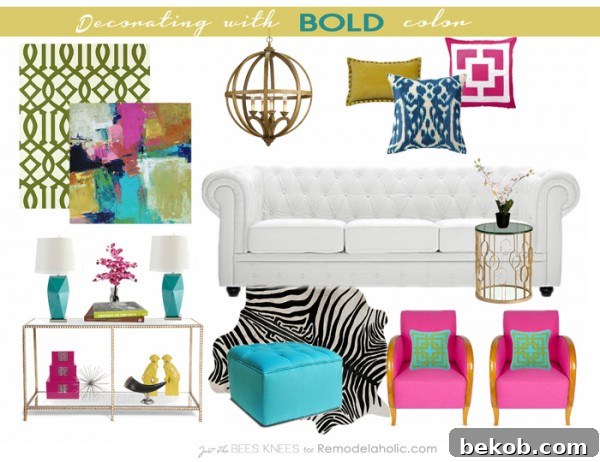
Explore sources and similar items featured in my vibrant Mood Board to inspire your own bold design!
And to my own surprise, I absolutely adore it! This mood board is a celebration of brightness, radiating cheerfulness and energy. It’s actually inspiring me to reconsider my own design choices and infuse some more daring, bold color into my personal living spaces. The impact of a thoughtfully chosen vibrant palette can truly transform a room, injecting personality and warmth that a purely neutral scheme might miss. Let’s delve into some other fantastic interiors that confidently embrace color, proving that stepping out of your comfort zone can lead to breathtaking results.
This magnificent oversized floral art piece serves as a breathtaking focal point, instantly infusing the entire space with an incredible burst of color and undeniable vibrancy. Its scale and rich hues demand attention, guiding the eye and setting the energetic tone for the room. Such a statement piece effortlessly transforms a wall into an art gallery, making bold decorating feel both sophisticated and inviting.
Don’t be afraid to experiment with painting the ceiling a bold color! Often referred to as the “fifth wall,” the ceiling offers an unexpected canvas for creative expression. I personally adopted this trick in my son’s room, and the results were transformative. It added so much character, depth, and a playful vitality that traditional white ceilings simply can’t achieve. A colored ceiling can create an illusion of intimacy in large rooms or elevate the dramatic impact in smaller ones, making the space feel uniquely curated and incredibly dynamic.
Sometimes, just a few strategically placed accessories are all it takes to introduce significant color without overwhelming a room. These carefully chosen accents add precisely the right amount of vibrant personality, offering a low-commitment way to experiment with bold hues. Think colorful throw pillows, decorative vases, vibrant books, or statement lamps – each contributing to a layered and interesting aesthetic that feels both inviting and chic.
Here, a striking fuchsia desk makes a dramatic statement, truly popping against the backdrop of a dreamy, deep cobalt blue wall. This bold pairing demonstrates the power of contrasting colors to create visual interest and energy. The carefully selected art and the fabric of the stool then serve to elegantly tie these vibrant elements together, ensuring the overall look is cohesive and harmoniously balanced, rather than chaotic. It’s a masterclass in combining high-impact hues with thoughtful curation.
Sources: 1/2/3/4
Are you feeling inspired to infuse some bold and exciting color into your own space? Breaking away from predictable palettes can truly revitalize your home, reflecting more of your personality and creating an environment that sparks joy. If the idea of decorating with vibrant hues feels a bit daunting, don’t worry! I’ve put together a few essential tips to help you confidently navigate the world of bold colors and get you started on your colorful design journey:
How to Decorate with Bold Colors
1. Not sure where to start? Take a look in your closet! This might seem unconventional, but your wardrobe is a treasure trove of your innate color preferences. The colors you consistently gravitate towards in your clothing, accessories, or even favorite pieces of jewelry offer a fantastic, personalized jumping-off point for your interior design choices. If you find your closet bursting with deep blues, emerald greens, or sunny yellows, these are likely hues you naturally feel comfortable with and that resonate with your personal style. Translate these preferences into your home by considering these colors for accent walls, statement furniture, or key decorative pieces. This approach ensures your decor feels authentic and truly reflects who you are, making the bold choices feel more natural and less intimidating.
2. Keep a neutral base. This is perhaps the most crucial rule when venturing into bold color territory. Approximately 70% of your space should ideally remain neutral. This neutral foundation acts as a calming canvas, preventing the bold colors from overwhelming the room and allowing them to truly shine. Think of it as a sophisticated backdrop that grounds your design. A neutral base can encompass a variety of elements: crisp white or soft gray walls, natural wood floors, plush cream rugs, or even metallic accents in gold, silver, or bronze. By establishing a predominant neutral scheme, you create visual breathing room, allowing your chosen bold colors to pop as intentional, eye-catching accents without making the space feel chaotic or visually restless. This balance is key to achieving a chic, vibrant, and well-composed interior.
3. Use a multi-colored piece of art, a patterned pillow, or a fabulous rug as your anchor. An anchor piece is your design’s guiding star – it’s the primary source from which you’ll pull your color inspiration. When faced with a blank canvas, choosing one item that features several colors you love simplifies the entire palette selection process. This could be a dramatic piece of abstract art, a beautifully intricate patterned area rug, a luxurious throw pillow, or even a unique upholstered armchair. Once you have your anchor, identify the key colors within it – perhaps a dominant blue, a subtle yellow, and an unexpected pink. These are the colors you’ll then echo throughout the rest of your space, ensuring a cohesive and harmonious design. This method eliminates guesswork and guarantees that all your chosen hues will naturally complement each other, creating a polished and intentional look. This leads me to my final, powerful tip:
4. Use the rule of 3. To ensure your bold colors feel intentional and integrated, rather than random or isolated, strive to use each chosen color at least three times within the space. This principle, often applied in design, creates visual balance and rhythm, guiding the eye around the room and making the entire scheme feel complete. For example, if you introduce a vibrant teal, ensure it appears in at least three distinct elements: perhaps a large upholstered ottoman, a collection of decorative books on a shelf, and a pattern in a piece of wall art. These repetitions don’t need to be identical; varying shades, textures, or forms of the same color family still count. The goal is to distribute the color strategically, preventing any single “pop” from looking like an afterthought and instead making it a deliberate part of a thoughtfully curated design.
If we revisit my initial mood board, you can clearly see how I meticulously applied these principles. I used the striking piece of art as my primary anchor, drawing inspiration from its vivid hues. From there, I pulled out the beautiful pink and strategically repeated it at least three times within the space, ensuring it felt purposefully integrated. I then followed the exact same process with the sunny yellow and the refreshing turquoise, distributing these colors thoughtfully to create a dynamic yet balanced environment. This systematic approach transforms a potentially overwhelming task into an enjoyable and successful design project.
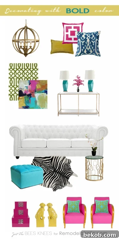
Find the sources and similar items from the inspiring mood board below to kickstart your own bold decor journey.
Do you have a bold color that has captured your imagination, perhaps a vibrant hue you’ve been drawn to, but have been hesitant or even afraid to incorporate it into your home decor? I sincerely hope that this exploration of bold color and these practical tips have instilled in you the confidence to take the plunge and go for it! Remember, design is about expressing yourself, and color is one of the most powerful tools at your disposal. Additionally, for further guidance on creating a truly personalized space, be sure to explore my expert tips on Mixing Decor Styles – another fantastic way to build a home that feels uniquely yours.
A huge thank you again to Cassity and the incredible Remodelaholic team for hosting me and allowing me to share my passion for design with all of you today! I’ll be back next month with more inspiration, but in the meantime, if you’re craving even more creative ideas and visual guidance, I invite you to check out my extensive Mood Board gallery over on my blog!
Take care! Sarah
—————————————–
For more exciting ideas and practical advice on embracing vibrant hues, dive into these other BOLD decorating inspirations and tips:
Tips for Selecting BOLD Paint Colors
Master the art of choosing the perfect intense shade for your walls and learn subtle yet impactful ways to integrate them seamlessly into your home’s aesthetic without overwhelming the space.
How to Design a Bold Home Office
Transform your workspace into an inspiring hub of productivity and creativity with daring colors and unique design elements. Learn how to craft a home office that reflects your personality and fuels your ambition.