

Transform Your Home: The Ultimate Guide to Choosing the Perfect Paint Colors
Embarking on a home decor upgrade often begins with a vision for fresh paint. Choosing the right paint color is one of the most impactful decisions you’ll make, capable of completely transforming the atmosphere and aesthetic of any room. Whether you’re planning a minor refresh or a major overhaul, the journey to selecting the perfect hues can be both incredibly exciting and surprisingly challenging.
Fear not! This comprehensive guide will walk you through 11 essential steps, mirroring the systematic approach professional designers use to curate stunning color palettes. These practical, easy-to-follow techniques will empower you to confidently select exquisite paint shades that perfectly complement your living space and personal style, ensuring a result you’ll love for years to come.
1. Analyze Natural and Artificial Lighting
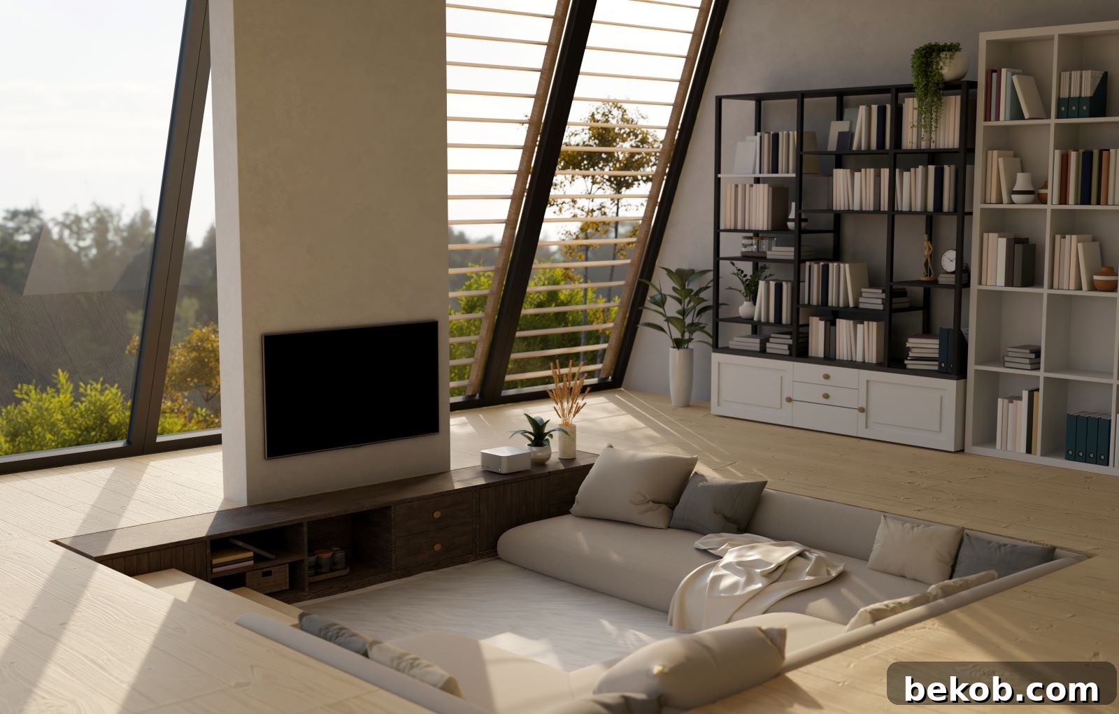
The role of light in how a paint color appears cannot be overstated. Natural light, in particular, profoundly influences a shade’s perception. Rooms facing north often receive cooler, indirect light, making colors appear slightly darker and more muted. South-facing rooms, conversely, are bathed in warm, bright light, which can intensify colors and make them appear more vibrant. East-facing rooms benefit from bright morning sun that eventually cools, while west-facing rooms experience warm afternoon light that fades into evening.
Beyond natural light, consider your artificial lighting sources. Incandescent bulbs tend to cast a yellow glow, warming up colors. Fluorescent lights often have a cool, bluish cast, which can make colors appear harsher. LED lights come in various color temperatures (warm white, cool white, daylight), offering more control over how colors are perceived. It’s crucial to observe how your chosen paint samples react under both natural daylight and the specific artificial lights you use at different times of the day. This dynamic interplay between light and color is a fundamental consideration in selecting a harmonious palette.
2. Define the Room’s Purpose and Desired Mood
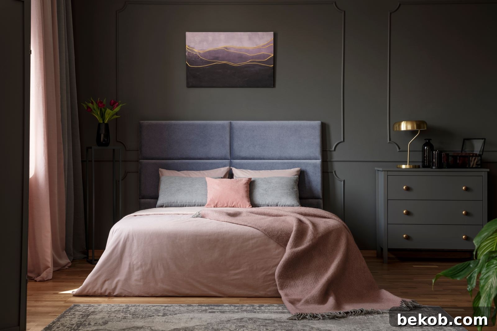
Before you even begin to browse color swatches, pause and reflect on the primary function of the room and the emotional atmosphere you wish to cultivate. The purpose of a space should heavily dictate its color scheme. For instance, a bedroom typically calls for colors that evoke tranquility, relaxation, and comfort, such as soft blues, calming greens, or gentle neutrals. These shades promote a serene environment conducive to rest.
In contrast, a home office or creative workspace might benefit from colors that stimulate focus, productivity, and inspiration – think muted blues, soft greens, or even crisp whites with bold accents. Dining rooms often thrive with colors that encourage conversation and warmth, like deep reds or rich blues, while bathrooms might lean towards clean, fresh tones. Defining the desired mood early on acts as a compass, guiding your color choices towards a cohesive and purposeful design.
3. Evaluate Existing Room Elements
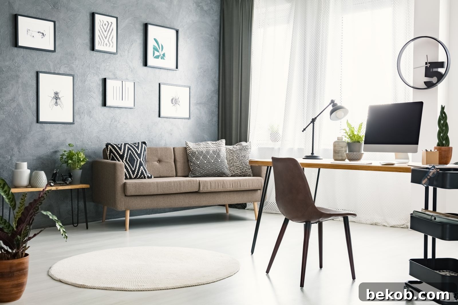
Your room is rarely a blank canvas; it already contains foundational elements that will influence your paint selection. Take careful stock of existing features like flooring (wood, carpet, tile), permanent fixtures (cabinets, countertops), large furniture pieces (sofas, dining tables), and any significant artwork or textiles. These elements often come with their own inherent colors and undertones that need to be considered.
The goal is to choose paint colors that harmonize with these existing components, creating a cohesive and integrated look rather than clashing. If your sofa is a prominent cool gray, a warm beige wall might create an uncomfortable contrast. Conversely, a subtle accent color from a piece of art could be pulled out and used on an accent wall to unify the space. By acknowledging and working with your room’s established palette, you can achieve a more sophisticated and well-thought-out design. Remember, the paint should enhance, not compete with, your existing decor. For more insights on this, explore how to pick a color palette for your home.
4. Understand Color Undertones
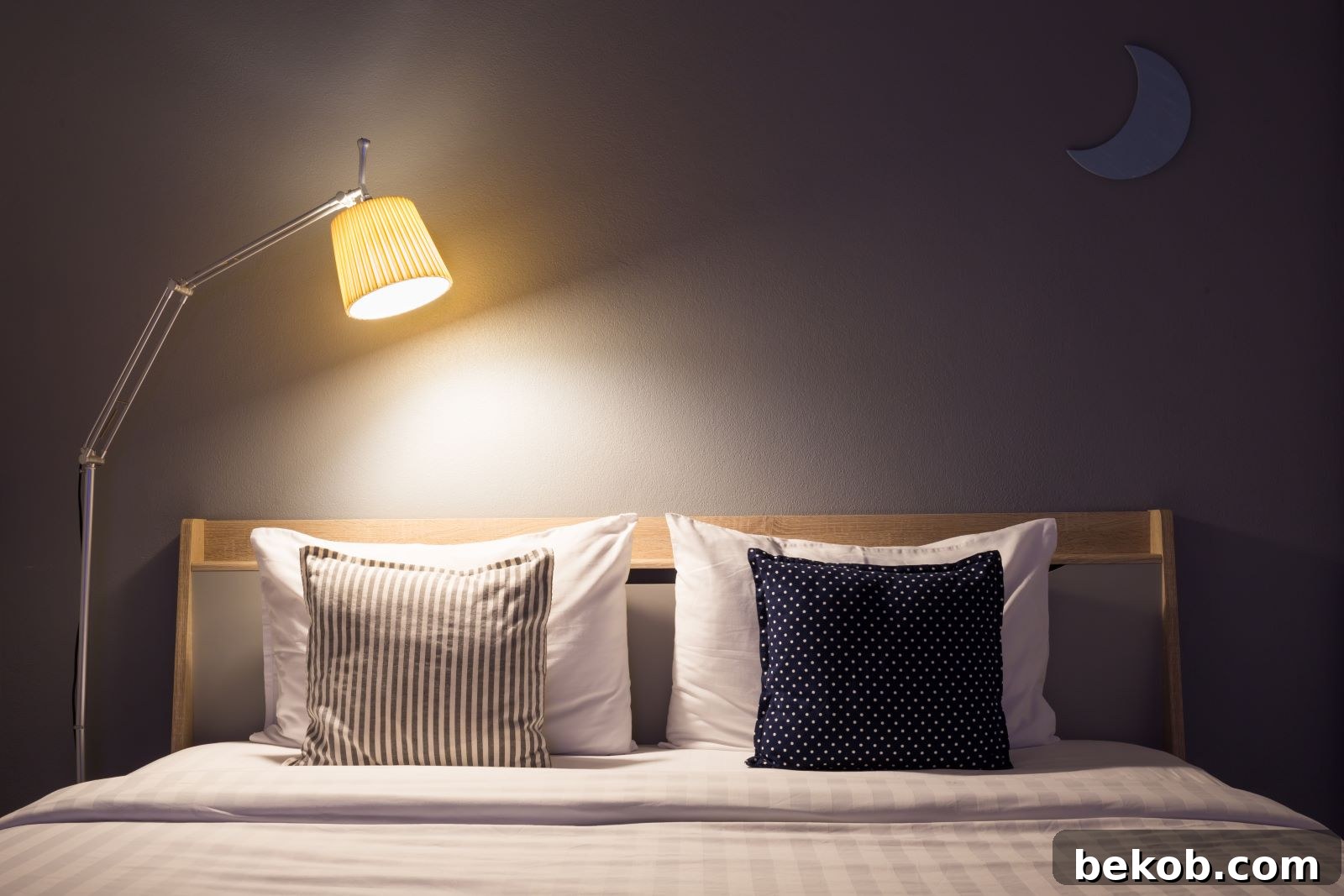
This is arguably one of the most critical, yet often overlooked, aspects of paint selection. Every color, even seemingly neutral ones like gray, white, or beige, possesses an underlying “undertone” – a subtle hint of another color. Grays can have blue, green, or even purple undertones. Beiges might lean yellow, pink, or green. Whites can appear warm (yellowish) or cool (bluish).
Understanding these undertones is vital for creating a harmonious space. A paint color with a cool blue undertone might clash with a flooring that has a warm orange-red undertone, even if both colors seem “neutral” on their own. To identify undertones, compare swatches side-by-side with true primary colors or known warm/cool tones. For example, place a gray swatch next to a pure blue, green, or purple to see which hue it subtly reflects. Matching undertones between your paint, furniture, and fixed elements ensures a cohesive and sophisticated look, preventing the common frustration of a color “looking wrong” once applied.
5. Explore Color Families and Palettes

To narrow down the vast array of paint options, begin by identifying a broad color family that resonates with your aesthetic and the desired mood of the room. Color families typically fall into warm, cool, or neutral categories. Warm colors, such as reds, oranges, and yellows, tend to energize a space and make it feel more intimate and cozy. Cool colors, including blues, greens, and purples, evoke a sense of calm and can make a room feel more expansive and serene. Neutrals – whites, grays, beiges, and taupes – provide a versatile backdrop, offering timeless elegance and allowing other decor elements to shine.
Once you’ve settled on a general direction, delve deeper into specific shades within that family. For example, if you lean towards cool tones, decide if you prefer soft pastels, vibrant jewel tones, or deep, rich hues. Understanding the nuances within each family will help refine your choices and move you closer to your ideal palette. For tips on incorporating more vibrant hues, read about choosing bold, bright paint colors.
6. Seek Inspiration from Your Surroundings
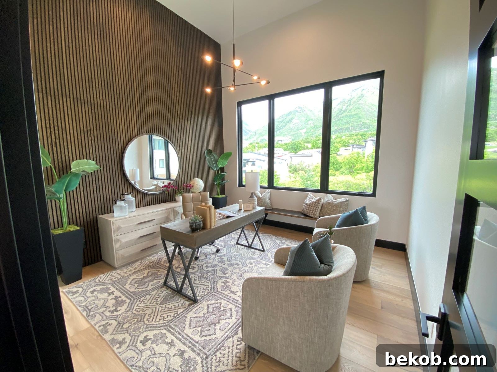
Inspiration for your paint colors can be found everywhere, often in unexpected places. Look around your home and your everyday life for items or scenes that capture your imagination. Perhaps it’s a cherished piece of art, a favorite patterned rug, a vibrant throw pillow, or even a beautiful landscape outside your window. Nature offers an endless source of harmonious color combinations, from the deep blues and greens of a forest to the warm tones of a sunset.
Carry these inspirations with you when you visit paint stores. Take photos, collect fabric swatches, or bring small objects that feature colors you love. These tangible sources of inspiration can serve as the perfect starting point for developing a personalized and meaningful color scheme for your home. Don’t be afraid to draw from personal experiences and tastes; after all, your home should reflect you.
7. Develop a Cohesive Color Scheme
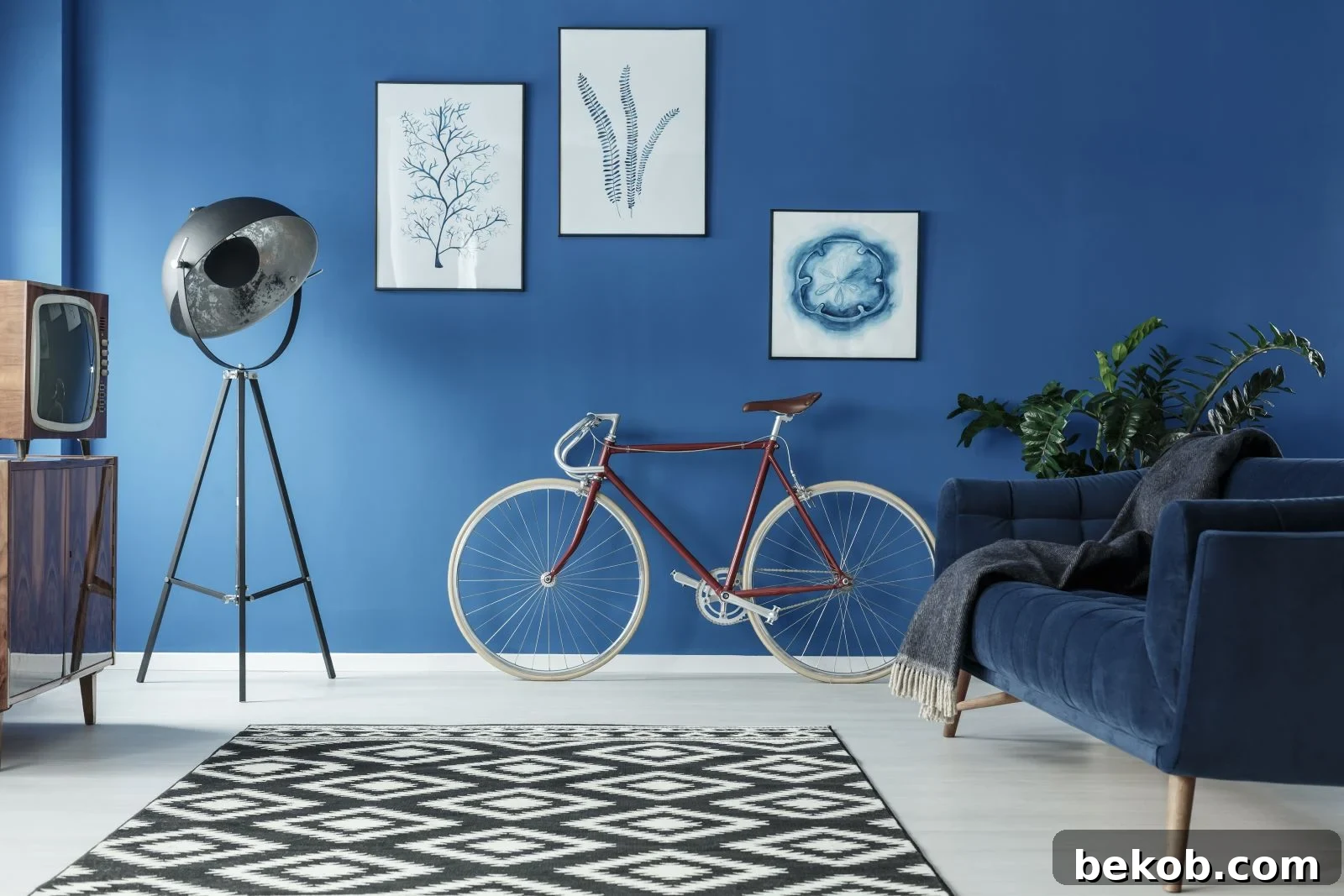
Once you have a general idea of the colors that appeal to you and suit your room’s purpose, it’s time to build a cohesive color scheme. A balanced scheme typically involves a dominant color, a secondary color, and an accent color. The dominant color will cover the largest surface area, usually the walls, setting the overall tone for the room. The secondary color provides depth and interest, often used for furniture, rugs, or drapes, complementing the dominant shade.
Finally, an accent color is a bolder, often contrasting, hue used sparingly in accessories like pillows, artwork, or decorative objects. This “60-30-10 rule” (60% dominant, 30% secondary, 10% accent) is a popular guideline for achieving visual balance and preventing any single color from overpowering the space. This structured approach ensures that your room feels harmonious, sophisticated, and thoughtfully designed.
8. Thoroughly Test Paint Samples

Never commit to a paint color without testing it extensively in your actual space. Paint swatches can be misleading, as colors often appear different on a small card than they do on an entire wall. Purchase several sample pots of your top contenders. Paint generous squares (at least 2×2 feet) on multiple walls in the room, or apply them to large poster boards that you can move around. This allows you to observe how each color interacts with your room’s unique lighting conditions throughout the day and night.
Pay attention to how the colors look in morning light, afternoon sun, and under artificial evening light. This crucial step helps reveal any unexpected undertones or shifts in hue that might not be apparent from a small swatch. Taking the time to test will save you from potential disappointment and costly repainting, ensuring your final choice perfectly matches your vision and the room’s environment.
9. Select the Right Paint Finish

The paint finish, or sheen, you choose significantly impacts both the appearance and durability of your walls. Finishes range from flat (matte) to high-gloss, each with distinct characteristics. Flat finishes absorb light, providing a rich, velvety appearance that can hide imperfections well, making them ideal for low-traffic areas like bedrooms or ceilings. However, they are less durable and harder to clean.
Eggshell and satin finishes offer a slight sheen, providing more durability and washability, making them popular choices for living rooms and dining areas. Semi-gloss and high-gloss finishes are highly reflective, durable, and easy to clean, best suited for trim, doors, kitchens, and bathrooms where moisture and wear are common. A glossy finish can make a color appear brighter and more intense due to its light-reflecting properties, while a matte finish will deepen and soften a color. Choose a finish that aligns with the desired aesthetic, the functional demands of the space, and the level of durability required. For more detail, refer to our guide on choosing the perfect paint sheen.
10. Utilize a Color Wheel for Harmony

The color wheel is an invaluable tool for understanding color relationships and creating visually pleasing combinations. It categorizes colors into primary (red, yellow, blue), secondary (orange, green, purple), and tertiary hues. By understanding how colors relate on the wheel, you can easily identify harmonious or contrasting schemes.
Complementary colors are those directly opposite each other on the wheel (e.g., blue and orange), creating high contrast and vibrancy when paired. Analogous colors are situated next to each other (e.g., blue, blue-green, green), offering a more soothing and harmonious effect. Triadic color schemes involve three colors equally spaced on the wheel, providing a balanced yet colorful palette. Using the color wheel can help you make informed decisions, whether you’re aiming for a bold statement or a subtle, cohesive look. Dive deeper into understanding color theory and the color wheel here.
11. Trust Your Personal Style and Instincts

After meticulously considering all the technical aspects of color selection, the final and most important step is to trust your own judgment and personal preferences. While expert advice and design principles provide excellent guidance, your home is a reflection of your unique taste and personality. If a particular color brings you joy or creates a feeling you desire, even if it deviates slightly from conventional rules, it’s often the right choice for you.
Don’t be afraid to experiment and infuse your personality into your living spaces. The most successful color schemes are those that strike a perfect balance between design harmony and genuine personal preference, creating a space that feels authentically yours and where you truly love to be.
By following these 11 steps, you’ll navigate the world of paint colors with confidence, ensuring your next home decor project results in a beautifully transformed and personalized living environment. The key to successful color schemes lies in balance, harmony, and most importantly, your personal connection to the chosen hues.
10 Tips to Choose the Perfect Paint Roller for Your Next DIY Project

Embarking on a do-it-yourself (DIY) painting project can be a rewarding and cost-effective way to refresh the look of your home. However, selecting the right tools is crucial to achieving a professional finish. One often overlooked but essential tool is the paint roller. With numerous options available, choosing the perfect paint roller for your project can seem daunting. This guide will simplify the process, helping you select the ideal roller for any surface.
Choosing the Perfect Paint Sheen: Top 10 Tips for Your Next Project

Are you struggling to choose the perfect paint sheen for your next project? The finish of your paint can dramatically alter the appearance and durability of a surface, but navigating the options from flat to high-gloss can be confusing. Don’t fret; we’re here to guide you with our top 10 foolproof tips, designed to help you make an informed and confident decision that will leave your walls looking their best.
Home Trends Going Out of Style

Home design trends are constantly evolving, with styles falling in and out of favor. What was once considered cutting-edge can quickly become dated, making your home feel less modern and potentially impacting its resale value. Let’s take a journey through some old home design trends that have seen their day. We’re talking about things that used to be popular but now often evoke a sense of “What were we thinking?” Here are 15 outdated home trends that are definitely due for a major makeover!
What is a Terrible Home Design Trend?

When dreaming of building or extensively renovating a new home, we often envision perfect spaces filled with innovative designs. However, the rapidly changing landscape of interior design means that some trends, though popular today, might quickly become regrettable. To avoid making costly mistakes that you’ll regret years down the line, it’s wise to be aware of the less desirable or fleeting styles. What are some of the horrible new home trends that we want to avoid in contemporary home design?
10 Home Renovations that can Decrease its Value

In today’s competitive housing market, with increasing interest rates and mortgage prices, maximizing your home’s value is more crucial than ever. While many renovations are designed to increase appeal and worth, some can unexpectedly have the opposite effect, actually decreasing your property’s market value. Homeowners and real estate experts often discuss these pitfalls. Here are the renovations to look out for, ensuring your improvements are truly investments, not liabilities.
Declutter Fast: 7 Items Experts Say Must Go!

A well-organized and tidy home is essential for showcasing its true beauty and creating a peaceful environment. Clutter can accumulate quickly, turning even the most stylish spaces into chaotic ones. If your living space feels untidy and overwhelming, it’s time for a swift and effective decluttering session. Here is how to declutter fast and get rid of these seven items that decluttering experts would advise you to remove right now!
DIY Artificial Plants for Outdoors on a Budget

Do you love the vibrant look of potted plants to enhance your outdoor space but often find yourself short on time for watering and maintenance? There’s a brilliant, budget-friendly hack that offers all the aesthetic appeal without the constant upkeep! Try this fantastic idea with beautiful DIY artificial plants for outdoors, enhanced with twinkling solar lights at night, creating an enchanting ambiance for a minimal cost per planter!